
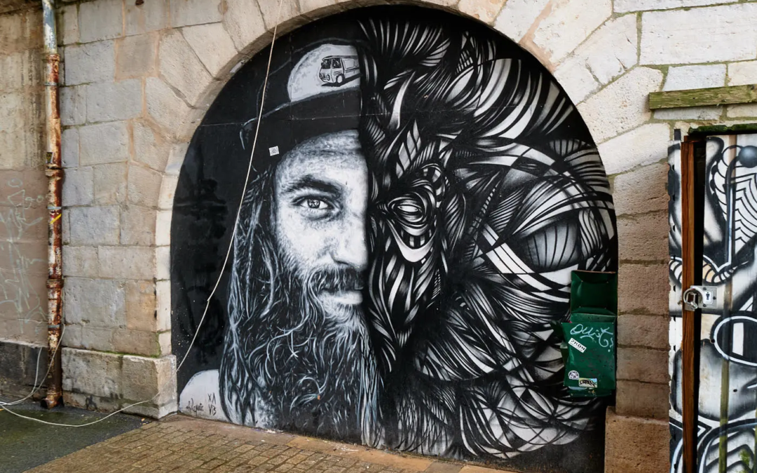
Black and white doesn't automatically make a scene stronger. It removes the color, but it does not give a subject to an image that does not have one. In the street, I use it to look differently: shapes, materials, shadows and the links between the elements. In Bayonne, a black and white fresco, posters on a wall and ordinary scenes offered very different starting points. These images exist in specific places. My job is to choose how to show them, without inventing what's going on.
I'm not leaving with the rule that a street photo should be black and white. I'm watching the scene first. If the color carries important information, I keep it. If it turns away from the shapes or contrasts that are of interest, black and white can become a fair choice. Here's how I take it, with examples of my walks in Bayonne.
Why choose black and white for a street photo?
I choose black and white when the scene is held mainly by its lines, its values of light or its textures. It can help bring together different elements, such as a poster, a wall and a silhouette. But it can also make an image less legible if the tones become too close or if the color was the real subject. The right choice depends on what the scene already tells.
A street photograph often contains several informations at a time. A sign attracts the eye, a person crosses the frame, the facades pile up and a shadow cuts the floor. In colour, these details can compete. In black and white, they reorganize according to their brightness and contrast. It's not necessarily simpler. This is another way to prioritize the image.
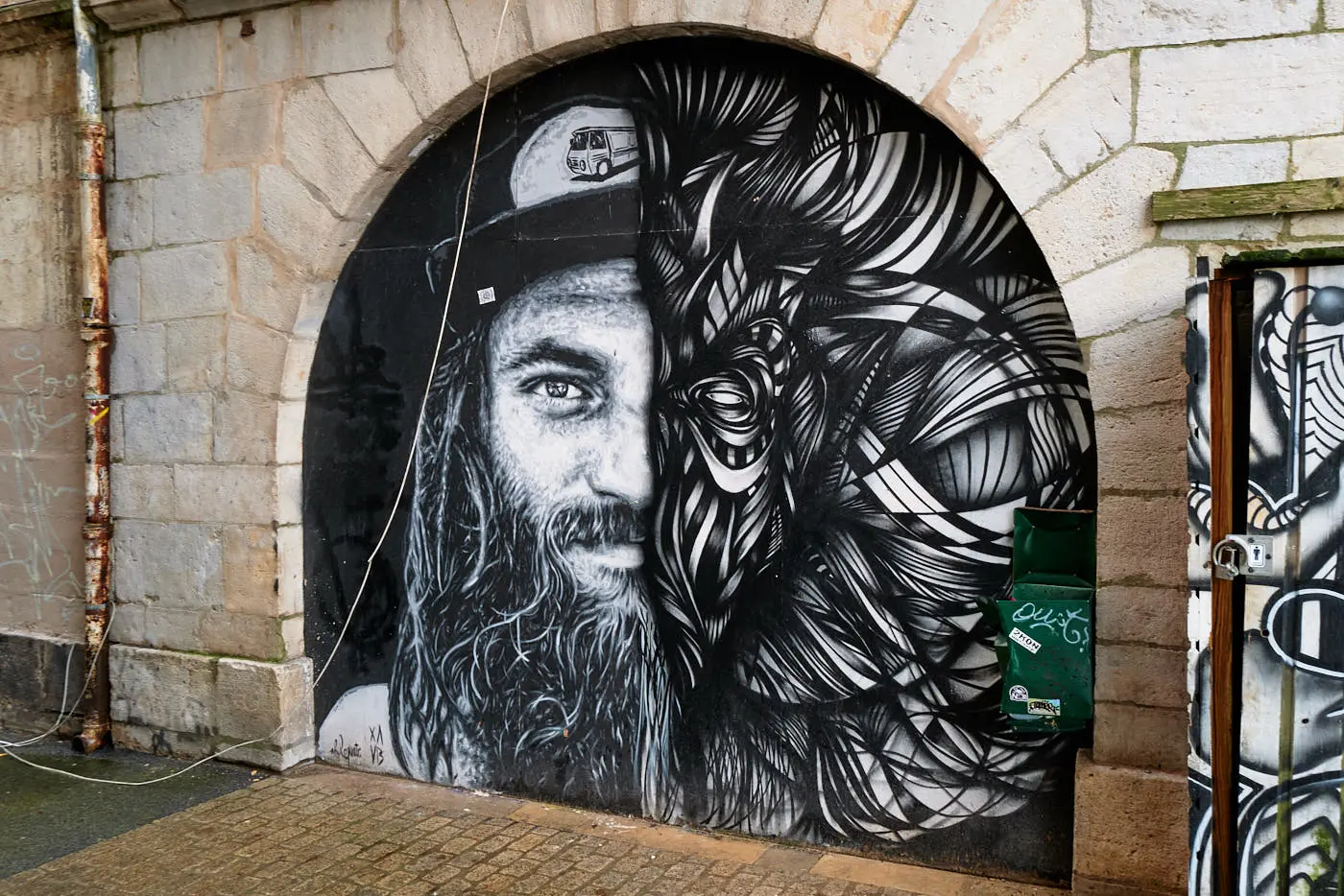
In Bayonne, I photographed a black and white face painted in a stone arch near the banks of the Nive. The work itself is already monochrome. The stone, the traces on the wall and the neighbouring passage add other materials. I don't need to add an effect to make the scene monochrome. Photography shows a real encounter between a painting, architecture and a street.
Identify contrasts before triggering
Before I think about the settings, I look at the light and dark areas. A pale wall next to a dark door can give a simple structure to the image. A silhouette in front of an illuminated facade stands out clearly. Conversely, two luminosity-like elements can melt one into the other. Sometimes I move a few steps to separate their contours.
The contrasts are not limited to deep black and bright white. A street can contain a range of grey: light stone, dark clothing, bitumen, metal, yellow paper. When these values remain distinct, the image retains matter. If everything becomes black or white without transition, some details may disappear. I prefer to check what I want to keep visible rather than looking for maximum contrast by principle.
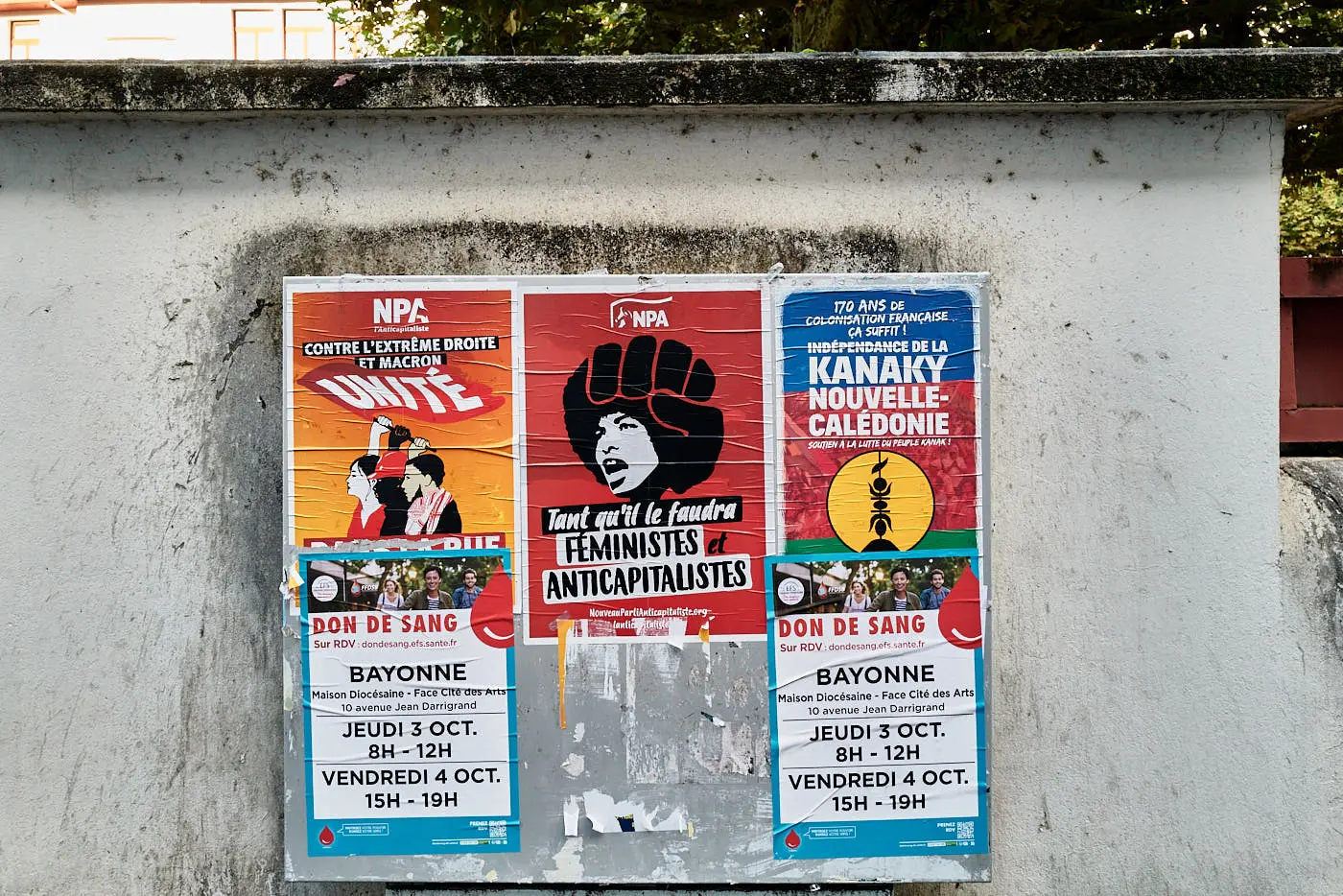
A street display scene in Bayonne is interested in repeating rectangles, torn edges and printed words. In colour, the posters attract attention by their red and blue flats. In black and white, the composition would depend more on the masses, letters and condition of the wall. These two readings are not always valid. The choice must come from the image, not from a general idea about black and white.
Read shapes and materials on the street
Black and white draws my attention to the surfaces. Stone does not look the same as paper, metal or crepe. A fried poster keeps track of rain and time. A part has marks of use. A facade may seem smooth from afar and become irregular when I approach. These details are often more visible when the colors do not take full place.
I also look at the repeated shapes: windows, arches, panels, poles or lines of a pedestrian crossing. A rehearsal gives a rhythm. An element that breaks this rhythm, such as a person or an isolated poster, sometimes becomes the point of attention. I don't need to fill the frame. A strong form and its context may suffice.
The street photo isn't just grabbing passers-by. A scene without a person can keep the traces of daily life: an open door, a recent poster on a worn wall, a displaced bench or a closed shop. These signs do not tell the whole story of the place. They give clues, and I make sure I don't lend them a story I can't verify.
Choose a light that keeps detail
Light changes the way surfaces appear. A side light reveals the relief of a wall. A diffuse light can make transitions softer. A direct sun creates clear shadows and can give a strong structure to the street. There is not an ideal light for all images. I look especially at whether it separates the elements or, on the contrary, crushes them.
In narrow streets, facades can alternate between bright and dark areas. I then check where the main subject is and whether its details remain legible. If a shadow becomes a great form in the composition, it can be useful. If it masks precisely what I wanted to show, I can wait or change my position.
I do not claim that Bayonne's photos presented here were taken at a particular time or in a specific light when this information is not indicated. The images show walls, posters and works in their photographed condition. For another shot, I can come back at another time and compare. The same street does not give the same image when the light changes.
Moving to simplify the frame
In the street, the first framing is rarely the only possible. I move, look at the edges and check for superpositions. A branch can cut a painted face. An architecture line can cross a poster. A step aside is sometimes enough to make the subject appear more clearly, or on the contrary to show that it belongs to its environment.
For a fresco, I try two distances. Close enough, I can show the lines and the surface. Further on, I keep the arch or the building, which gives the viewer an idea of the scale and the place. The two images do not have the same role. The first one looks at the work as a form. The second one tells more about his presence in the street.
This choice joins my approach to urban photography I'm looking for relationships between places and uses, not just an isolated pattern. In another guide, I detail the practical steps to photograph the city and choose its framing. Here, the black and white m
Photographing people with attention
A person can give a ladder to a facade, connect two parts of the frame or bring a movement. It is not indispensable. When it becomes the main topic, I pay attention to how the scene is taken and disseminated. I'm not trying to turn someone into a compositional accessory without taking into account the context.
Sometimes a street scene is stronger without a recognizable face. A back silhouette or a remote presence may be sufficient to indicate the scale. And sometimes, the place itself holds my attention: a facade, a passage, a poster that changes. Black and white must not push to make a scene « dramatic » just to get a bigger picture.
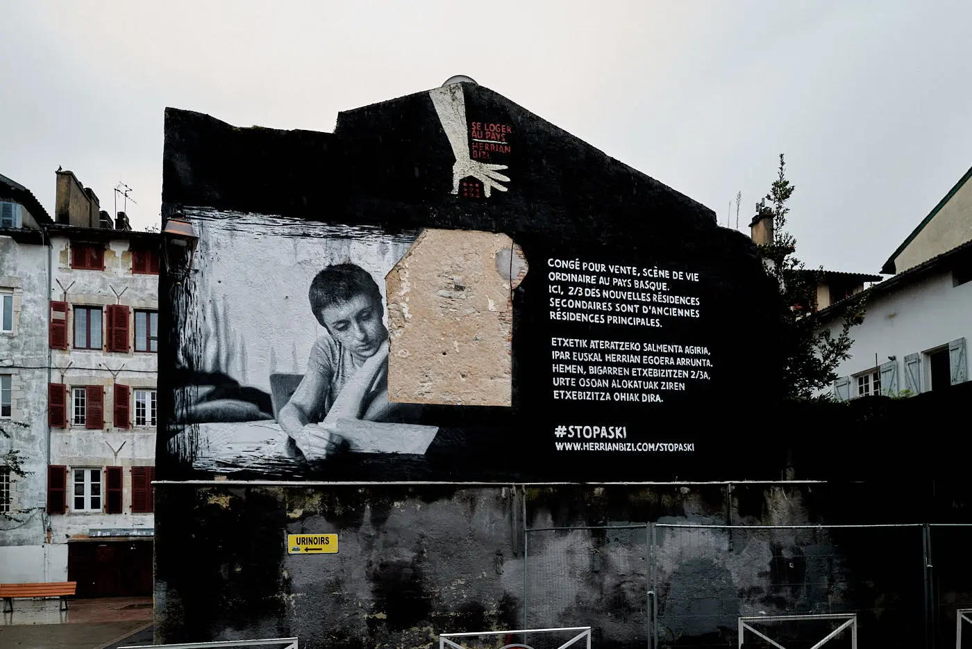
I also keep a simple distinction between what I see and what I interpret. A poster gives you to read words. A wall carries a fresco. A street shows shops and houses. I can tell what these elements evoke, but I don't actually transform an impression about people or the neighborhood.
Color or black and white: how to decide?
When color is at the heart of the scene, I keep it. A red poster, blue shutter or coloured light can be the subject, not a distraction. When the image depends rather on a relationship between forms, light or matter, black and white may be suitable. To decide, I can compare the two versions and ask myself three questions.
- What does the color m
- In black and white, are the important forms still distinct?
- Does the contrast add a reading, or only an effect?
These questions do not give an automatic answer. They help identify what I want to leave in the foreground. A poster scene can work in color because the colors are part of its language. A monochrome fresco in an arch can already contain a strong relationship between tones and stone. The best version remains the one that respects the photographed subject.
Build a small series of street photos
A walk can produce many similar images. To select them, I seek a real variation: a wide view, a detail of matter, a passage scene, a form that returns. If three photos tell exactly the same thing, I keep one rather than align them all. A short series leaves more room for each image.
Black and white can give consistency to different scenes, but this consistency is not enough. I also see if the contrasts vary, if the images breathe and if the order creates a progression. A very dark photo followed by a clear image can take a break. A wide view can set out the details that follow. There is no mandatory order, only attention to rhythm.
To keep the link with the photographed places, I note if possible the neighborhood or street, as well as the information I really know. This avoids confusing one image with another and making details when writing a legend. The photographs of Bayonne bring together several of these walks and allow to review the scenes in their context.
From file to black and white print
A monochrome image can also become a drawing to look at in a room. Before choosing a format, I check whether the details that count remain legible at the expected distance. A photo with small inscriptions or tight textures may require a size that allows time to observe them. A simpler composition can work differently. The drawing does not change the photographed place, but it changes the distance and time spent in front of the image.
The paper, pass-out and frame modify the presentation. They must not distract attention from the image. Options vary according to the proposed draw. To understand the paper and support markers, I present the Fine Art photo print. To choose a frame and format, I also detail the framed photo print. The precise work sheet must always be checked, as the available finishes are not identical everywhere.
A black and white photograph does not need a black frame to be presented. A clear frame, a pass-out or a lack of a pass-out can change its relationship to the wall. I start by looking at the edges of the image and the dominant tones, then I compare with the room where it will be hung. The decision remains linked to the work and space, not to a universal decorative rule.
Frequently asked questions on the black and white street photo
How to start the black and white street photography?
Start with a simple scene and observe the differences in light between the subject and its environment. Check the edges of the frame, try a second view and see if the shapes remain distinct without color. A device or phone you know is enough to learn how to observe.
Is black and white suitable for all street photos?
No. If the colour carries important information, such as a poster or clothing that structures the image, removing it can weaken the photo. Black and white works better when forms, values and materials support reading.
Should the contrast be increased in black and white?
Not systematically. A strong contrast can clarify a shape, but it can also make the details disappear in shadows or high lights. The goal is to keep the elements necessary for the image, not to get as hard a contrast as possible.
Can we photograph black and white frescoes?
Yes, if monochrome reading is suitable for the work and the stage. Some frescoes are already in black and white. For others, colour can be essential. It is useful to compare the two renderings and to keep the one who best respects the artist's work and the context of the wall.
What difference between street and urban photography?
Both approaches overlap. The street photo often attaches to scenes captured in public space, with or without passers-by. Urban photography can also focus on buildings, uses and organization. The subject and the photographer's gaze count more than a strict boundary between the two.
Watch before choosing rendering
Photographing the street in black and white does not involve applying a filter to each image. I first look at what holds the scene: a form, a matter, a contrast or a use of the place. Then I decide whether the color should stay or whether it takes too much space. In Bayonne, the posters and the fresco of the arch gave two different answers. A guard of important colors. The other already exists in a monochrome range that dialogues with the stone.
The next time you walk with a device, try to make a color image and a black and white image of the same subject. Compare what each one reveals and what it removes. Then choose the one that best tells what you actually saw.