
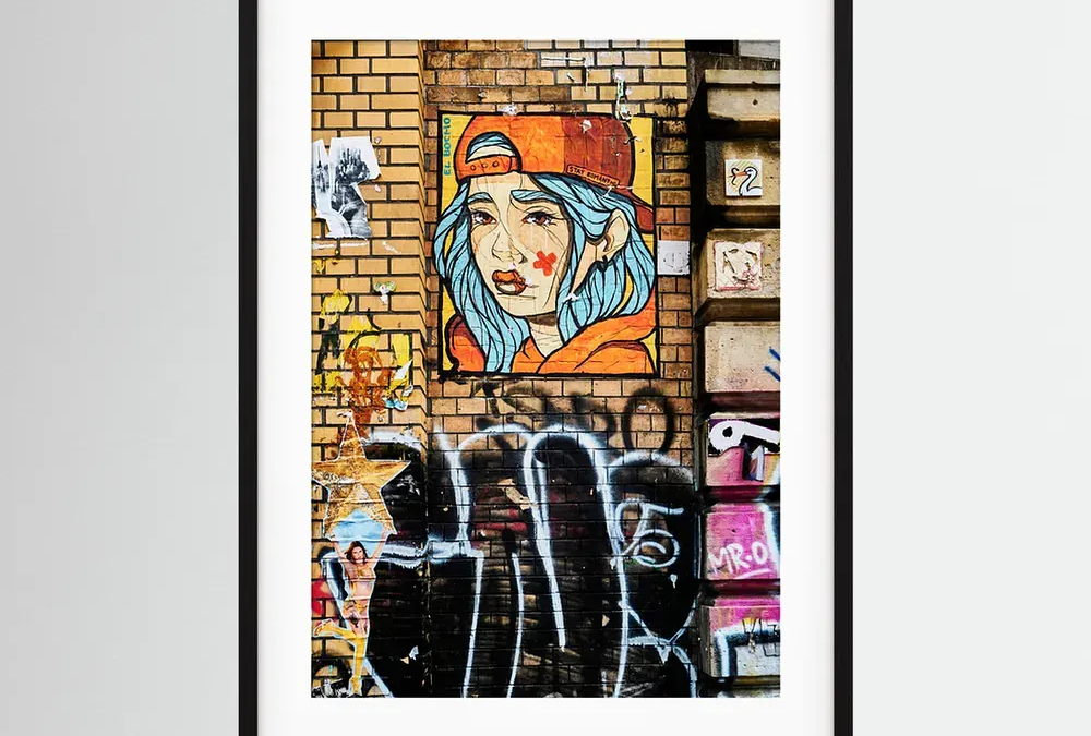
A framed drawing is not only chosen according to a wall color. The format, the space around the image and the frame change the way you look at it. A tight street scene can gain in presence in a large setting. A quieter image can breathe thanks to a clear margin. There is no rule that works for all photos. I leave the picture, then look at the room.
At my shop, the prints come from my original photographs. Some images show the painted walls of Berlin, others urban scenes or details that stopped walking. To discover how I photograph painted walls leaving their surroundings in the frame, I also told about my walks in this article on the photo street art in Glasgow and Bessèges. The prints are available in several formats, with all-round and frame options according to the works. Here are the points I look at before choosing a framed photo print. To understand also what distinguishes the paper and the rendering of Fine Art photo print, I gathered the markers in a dedicated guide.
Start with the image, not with the frame
I first look at what keeps my eye in the photograph. Is it a face, an inscription, a front line or an entire scene? Should the look go directly to the center, or take the time to go through several details? The answer helps to choose a size and frame that accompany the image instead of competing with it.
In a street art photograph, for example, the wall is part of the composition. The bricks, the layers of paint and the traces around the subject also tell something. Too small a format can reduce these details to color spots. A very heavy frame can add a second decor around the wall. I often prefer a simple frame that lets the photograph speak.
Conversely, a portrait or graphic detail can work in a more compact format. The subject is readable closely. He doesn't need to occupy a whole wall to keep his presence. The right format is not always the largest. It's the one that lets you see what counts in the image from the place where you're going to look at it.
Choose the format according to the wall and distance
Before ordering, I measure the available space. I look at the width of the cabinet below, the distance with the doors and windows, and the height at which the image will be hung. This gesture avoids a frequent error: choose a format by looking only at the screen, without representing its actual congestion.
A simple method is to cut a frame-sized rectangle into newspaper or kraft paper. It is temporarily attached to the wall with repositionable tape. We can then check the space left around, the relationship with the sofa or office, and the effect from the entrance of the room. It's more telling than an image displayed on a phone.
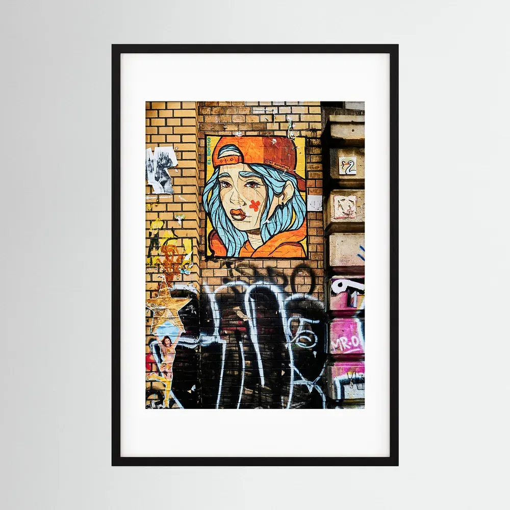
On one of my prints, A Young BERLIN Girl CollageThe announced formats range from 21 × 29.7 cm to 50 × 70 cm, with an intermediate format of 29.7 × 42 cm. These dimensions give quite different scales. The small format can be seen in a reading corner or on an already composed wall. The large format can become the main point of a clearer wall. Consideration must also be given to the final size of the frame, which exceeds that of the image itself.
When several images are gathered, I keep a little consistency between them. Frames can have the same color, or prints can share a palette. Sizes don't need to be the same, but net alignment or regular spacing helps keep the set up. Before I drill, I put the formats on the floor and take a picture of the composition. It allows you to move an image without leaving a series of holes in the wall.
What's the whole thing for?
The pass-out is the visible border between the photograph and the frame. It creates a resting area around the image. It can also help visually separate the picture from the frame, especially if the colours are close or the wall is already very present.
A clear margin is often suitable for coloured or dense images. She gives them space, like a pause around a scene full of details. For a more graphic photograph, a more discreet margin can keep the image compact and direct. I don't choose the pass-out so that it is a decorative element by itself. It must serve the rhythm of the image.
We must also look at the proportions. Too narrow a margin may seem accidental. A generous margin may give importance to a small image, but it changes the outside size of the frame. It is therefore necessary to check the complete dimensions and not only those of the drawing. If the catalogue offers this option for the selected work, look at the rendering and the measurements before validating. Options may vary depending on the product and format.
Which frame to choose for a photograph?
I start with simplicity. A black frame can bring out bright colours and create a clear outline. A light wood gives a softer presence and easily blends with natural materials. A darker wood can strengthen blacks or echo an already present furniture. But these markers don't replace the test on the wall. The light of the room and the color of the painting change the result a lot.
For a street photo, a discreet frame avoids giving the impression that the subject was added to the scene after the blow. It accompanies the image without imitating its decor. For a quieter photograph, you can choose a finish that prolongs your atmosphere. I still keep a limit: if the frame attracts an eye before the photo, it probably takes too much space.
On the pages of my shop, the options displayed depend on each print. The A Young BERLIN Girl Collage indicates a Black Wood frame made by hand in Italy. The home page of the drawing shop also presents choices of formats, passwords and frames according to the works. I always check the drawing sheet concerned: it should not be assumed that each option is available everywhere.
Watching paper and finishing
The frame protects and presents the drawing, but the surface of the photo is equally important. A textured matte finish can give a different presence of a smooth surface. It can soften the reflections and make the material of the paper feel, while keeping the details of the image. The rendering depends on photography, light and distance of sight.
The sheet of my Berlin print describes a paper without acid or lignin, with a natural finish and a textured matte surface. These are characteristics specific to the product presented. For another print, the best is to read the details associated with the work rather than generalize the same properties to the entire collection.
In a very bright room, I also look at the location before choosing. A window in front of the frame can create reflections that mask part of the image. A side wall or area that does not directly receive the sun can make photography more enjoyable to look at every day. Even a good choice of glass or frame does not always compensate for a light that falls exactly on the surface. For unsuspended prints or handling precautions, j how to keep a photo print at home.
Think where the draw will be hung
Above a piece of furniture, I leave a visible space between the frame and what is underneath. An image too high may seem detached from the rest of the room. In a corridor, where it passes near the wall, a smaller format can be easily read. In a room where people sit at a distance, a larger print makes more details accessible.
For a composition of several frames, I first choose a main image. Other prints may extend it by their subject, their colours or a form that returns. A group does not need to be perfectly symmetrical. He needs a wire. For example, several urban scenes can respond without showing the same city or having the same format.
I also take into account objects close to you. A plant, lamp or coloured piece of furniture can interact with an image tint. It is not necessary to match each element. A single repeated color in the room is often enough to create a link. And if the wall is already animated, a single well-chosen photograph can have more strength than a too heavy set.
Simple mistakes to avoid
- Choose without measuring. Checks the width of the complete frame, not just that of the photograph.
- Copy a decor seen online. The light, the ceiling height and the furniture are different in you.
- Take the largest default format. A small image can be more accurate if it invites to approach.
- Choose a frame that repeats the colours of the wall. A slight contrast often helps distinguish the photo from its environment.
- Forget the reflections. Observe the light at different times of the day before fixing the location.
- Suppose all options exist for each photo. The formats and finishes must be checked on the selected drawing sheet.
In summary: let the image guide the choice
To choose a framed photo print, I first look at what the image requires. A subject rich in detail needs a size where these details remain legible. A pass-out can give him air. A simple frame can frame the look without competing with photography. Then I check the dimensions on the wall, the light and the options actually proposed for this work.
In my selection, the photographs are original images, made on the ground. The prints are made on demand and the product sheets specify the formats and options available. You can walk the photo prints of Mixel Jamon, then consult the page of the image that interests you to see its dimensions and possibilities of framing. I prefer this last check to a general rule: each photograph deserves a choice adapted to what it shows.