
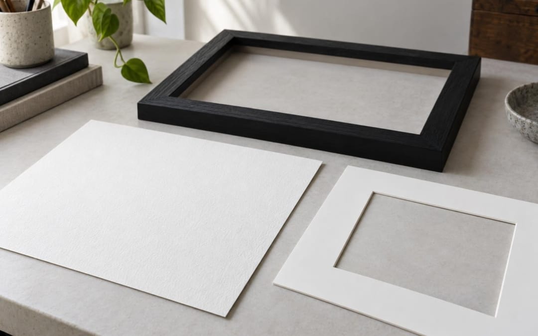
Fine Art is not just a photograph printed on thicker paper. There is the image, the way it was prepared for the paper, the medium chosen and how the print will be presented. For me, the choice always begins with photography. The paper and frame must accompany it, not transform it into a standard object.
In a few words, a Fine Art print is a photographic print conceived as a work to look at and preserve, made on paper chosen for its rendering and qualities. But the expression is not enough to describe a specific product. It alone does not guarantee a given paper, a printing method or a shelf life. The characteristics of each draw must be read.
I photograph streets, daily scenes, travels and painted walls. To tell the story of these walls in Glasgow and Bessèges, I also devoted an article to the photo street art. Once the image is selected, it exists as differently than on the screen: in a format, with a surface, a margin and possibly a frame. Here are the markers I look at to choose a Fine Art photo print and understand what is really behind this name.
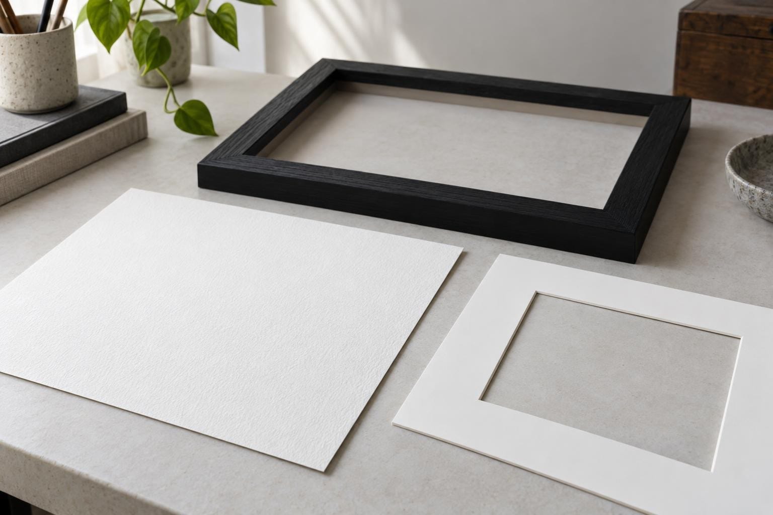
What does it mean? « Fine Art photo print » ?
Fine Art usually refers to an art impression intended to be regarded as a work, rather than a simple utilitarian copy. He evokes attention to image quality, paper and rendering. But the word does not automatically indicate the gramming of the paper, its appearance, the inks used or the conditions of manufacture.
Two prints sold under this name may therefore have different characteristics. One will be matt and slightly textured. The other may have a smoother surface or a different white. A good description should help to understand the support, available formats and options for framing. If this information is missing, it is better to ask them before choosing.
Avoid taking « Fine Art » Like a magic formula. What matters is the photograph that one wants to keep before the eyes, then the way the paper serves its nuances and details. A very contrasting image, a discreet portrait and a painted wall do not necessarily call the same surface or format.
Why does paper change the reading of a photograph?
On a screen, the image is emitted by a light. On paper, we look at it under the light of the room. Texture, white support and reflections then influence perception. Paper is not an invisible detail. It is part of the drawing experience.
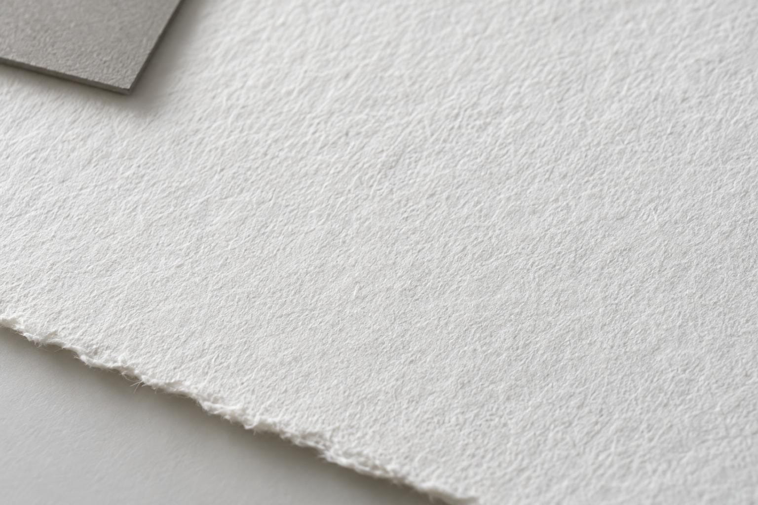
A matte surface can limit some reflections and give a softer impression. A visible texture can be pleasant on an image where one wants to take the time to look at the materials. But it is not necessarily the best choice for all photographs. On an image based on very fine details or frank colours, the surface can change the perceived rendering. There is no perfect paper in the absolute.
Gramming is also an indication, not a judgement of quality alone. A heavier paper often gives a firmer feel in hand, but it does not say everything about the surface or its composition. To compare two products, I first look at the complete information: name of the paper if it is indicated, finish, dimensions, presence of a universal pass and characteristics given by the manufacturer.
How to choose an artistic photo print?
I start by wondering what stopped me in the picture. Is it a face crossed in a street, an inscription on a wall, a set of lines or a light that will last only a few minutes? This answer helps choose a photograph that will still have something to give after the first impression.
Then I look at the scene the size where it will be hung. A street photograph can contain several planes: a passer-by in the foreground, a facade, and then an almost hidden detail. In small format, the eye goes directly to the main topic. In larger, it can walk more in the image. The format is therefore not only used to fill a wall. It also regulates the reading distance.
I finally check the color and contrast in the original image, not only in a catalog thumbnail. A night scene, a colourful wall and a grey landscape do not react in the same way to the paper and light of the room. When it is not possible to see a printed sample, the product information and the photograph displayed remain the best available benchmarks. A screen does not promise exact color matching.
The details to read on the card of a draw
- Paper. Look for its name or characteristics, its finish and, if given, its composition. « Fine Art » Only does not allow you to know what you will receive.
- The format. Check the dimensions of the image and those of the framed product, which may be different.
- The pass-out. See if it is proposed, its color and the margin it adds around the photograph.
- The frame. Materials, colour and availability may vary depending on the work and format.
- Manufacturing. Check who prints, where and on request or not. This information should come from the record or from the seller.
- Shipping. Check up-to-date information on preparation, deadlines and fees before ordering.
At my shop, prints are made on demand by PRINTUMO. The formats, pass-out and frames are chosen according to the work and the options displayed on its page. I advise you to look at the precise print description rather than assume that all photographs have exactly the same options.
From file to draw: what changes
A photograph displayed on a screen is not yet a print. The screen illuminates the image, while the paper returns the ambient light. The contrast may therefore seem different, and a bright color may not have exactly the same presence on each medium. This is one of the reasons why the draw is prepared taking into account its destination.
The format also counts. A detail that seems secondary on a screen can become central once enlarged. Conversely, a small image can focus the look and create a closer relationship. For a photograph composed of several planes, I reflect on the distance from which it will be viewed. For a more graphic image, I pay attention to the balance between the subject and the margins.
The choice of paper should not erase this work. It must offer support consistent with the image and allow to look at it in good conditions. This is why an artistic photo print is best chosen from the work and its future location than from a general promise on paper.
Choose a format and frame
To imagine the result at home, I first measure the wall and furniture around. A sheet can be cut to size, fixed for a few minutes and watched from the entrance of the room, then from the place where it sits. This simple test is more reliable than choosing only from an image on the phone.
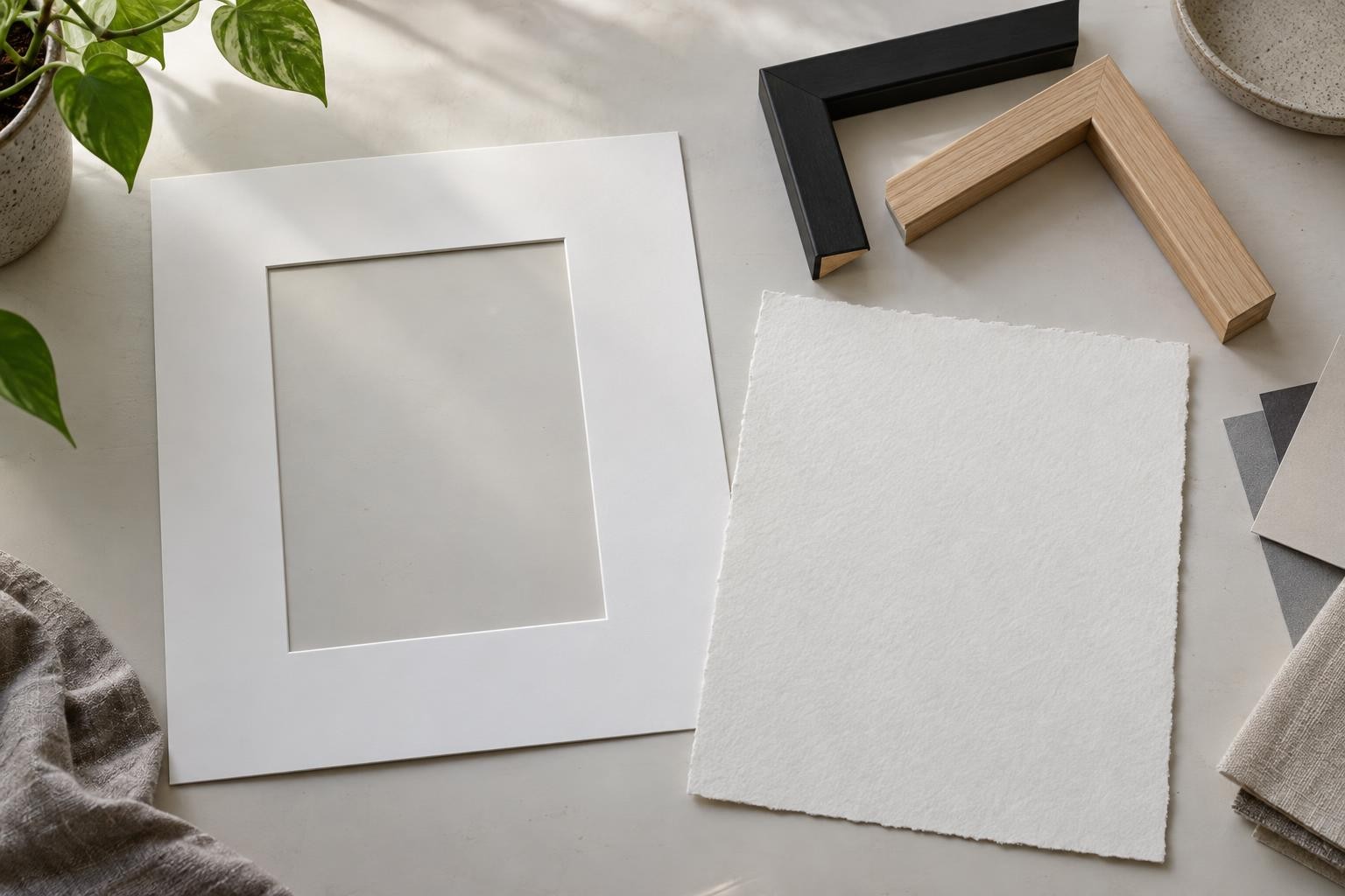
A passout creates a border between the photo and the frame. It can give air to a tight composition or help a small image find its place on a wall. A discreet frame, on the other hand, lets the image take over more easily. But the right choice always depends on the photograph and the place. For measures, examples and options to compare, I have detailed how to choose the format, pass-out and frame of a photo print.
Light also deserves a try. A window-mounted frame can reflect the room and hide part of the photo. A side wall or a place without direct sun is often more comfortable. For home storage and precautions, here is also my guide on keeping a photo print at home.
How to recognize a clear offer?
A serious offer is not a single adjective. I am looking for concrete answers: what paper is proposed for this image, what dimensions are available, is the frame included or optional, and which ensures printing and sending? These questions allow to compare products without confusing an impression from its own files with an art print from an original photograph.
I also check that the information is relevant to the work I am looking at. Options may change between two formats or two photographs. A paper or frame advertised on a page does not necessarily apply to the entire collection. If a detail is not indicated, it is better to ask rather than interpret it.
Finally, the word « archive » or a storage statement should not be understood as a guaranteed duration under all conditions. Sun exposure, moisture, mounting and handling also play a role. I present the characteristics given for each product, without promising that the image will remain the same indefinitely.
A photo art print must first remain an image
The characteristics of the paper are useful, but they do not replace the choice of photography. In my images of the city, I often return to the details that one crosses without seeing them: a half-effaced inscription, a face at the detour of a wall, a light on a facade. The drawing allows to make a place for these scenes in an interior, on a scale where they become familiar.
I prefer to choose an image that resonates with a particular memory or attention, then think about paper and frame. The quality of a drawing is not limited to its specification. She also cares about how we look at him, his presence in a room and what he reminds us of after several years.
To discover the images available and their current options, you can browse the Mixel Jamon drawing shop. Each sheet specifies the choices offered for the work. And if you hesitate between several images, start with the one to which you return spontaneously. The rest, format, paper and frame, then choose around it.
Frequently asked questions about Fine Art photography
What is the difference between a Fine Art print and a classic photo print?
The expression Fine Art refers to an impression designed to present a photograph as a work, with attention to support and rendering. It is not enough to define paper or method. To compare, read the specific product characteristics and check the presentation options.
Is thicker paper always better?
No. The grammage describes the weight of the paper, not only its texture, composition or rendering. We must look at all the characteristics and how they serve photography.
Does matt paper fit all photos?
Not necessarily. A matte surface can reduce some reflections and give a soft rendering, but the choice depends on the subject, details and light of the room. Whenever possible, compare a sample. Otherwise, press the product sheet and keep in mind that the screen does not return exactly the paper.
How to choose the format of a draw?
Measure the wall, represent the frame with a sheet of good dimensions and look at the result from several places. Choose also according to the reading distance and the amount of details you want to see in the photograph.
Do the same options exist for all works?
No. The formats, passwords and frames can vary depending on the image. Always check the selected draw sheet to find out the options actually offered.