
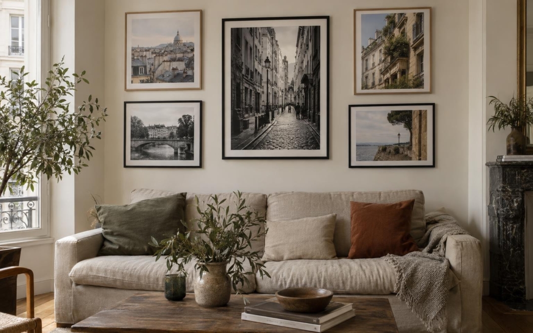
To compose a photo wall, I first choose the images, not the frames. A black and white street scene can interact with a colorful facade, provided that a detail links them. Then I test the floor layout, check the dimensions on the wall with paper templates and keep regular spacings. This method avoids random drilling and helps to see if the whole looks like a small collection rather than a series of images placed side by side.
There is no perfect composition for all interiors. A narrow wall, a low sofa or an already full room require different choices. I prefer to leave a photograph that counts for me, then build around it. Here are the steps that I use to organize a photo wall with different prints, formats and frames.
How to compose a photo wall?
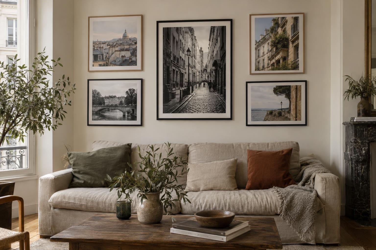
First choose three to seven images that have a link between them, without trying to match them perfectly. Then determine a main image, put the frames on the ground and move them until you find a balance. Reproduce the dimensions with sheets of paper on the wall, then adjust the distance and height before fixing anything. If you hesitate, start with three frames. It will always be possible to add images later.
1. Choose a thread between the images
A photo wall works better when the images respond. The link can come from the subject, colors, place or atmosphere. For example, three city photographs can show different things, one street, one facade and one wall detail, while sharing one pallet. Conversely, images taken at the same location can create a coherent set even if their colors vary.
I often look for a discreet link rather than a uniform series. A black-and-white picture can come in close contact with a color image if both have a common rhythm or shape. A vertical line in one facade can respond to a tree in another image. A small note of red may return from one draw to another. It is sometimes these echoes that we notice after putting the images together.
To avoid the catalog effect, do not choose five almost identical images. Keep a variation of plans: a wide view, a closer subject, a detail. It gives a rhythm to the wall and leaves space to look at. If you like urban scenes, the guide on urban photography and daily details can also help to look at places as a set of possible topics.
2. Designate a main image
In a composition, the eye needs a starting point. Choose a larger, more contrasting or more detailed photograph to play this role. Place it in the center if you want a symmetrical set. In a freer arrangement, it can be slightly shifted, provided the other frames balance its visual weight.
A main image does not need to be the greatest. It can be the one you hold the most, the one whose subject immediately attracts the look or the one that sets the tone for the series. The other images can then accompany it. Think of them as sentences around a central idea, not like thumbnails that fill holes.
If all photographs have the same size and intensity, no entry point will be detached. It's not necessarily a problem for a regular grid. But for a freer wall, a dominant image often gives a clearer reading.
3. Choose a room-friendly layout
A regular grid is suitable for frames of the same format. It gives a calm and orderly impression. Align the outer edges and keep the same space between each frame. This arrangement often works over a long piece of furniture, where horizontal lines are already present.
A composition centered around a large image allows to mix formats. Place the main frame, then add the others on each side with a visual balance. Frames do not need to be symmetrical. On the other hand, avoid one side appearing much denser or darker than the other.
A horizontal line works in a corridor or above a sofa. For a narrow wall, a vertical layout can better use space. And if you have several frames of very different sizes, draw an imaginary, rectangle or square outer shape, then try to keep the set inside. This brings coherence without forcing each framework to follow a grid.
4. Test sizes and spacings without drilling
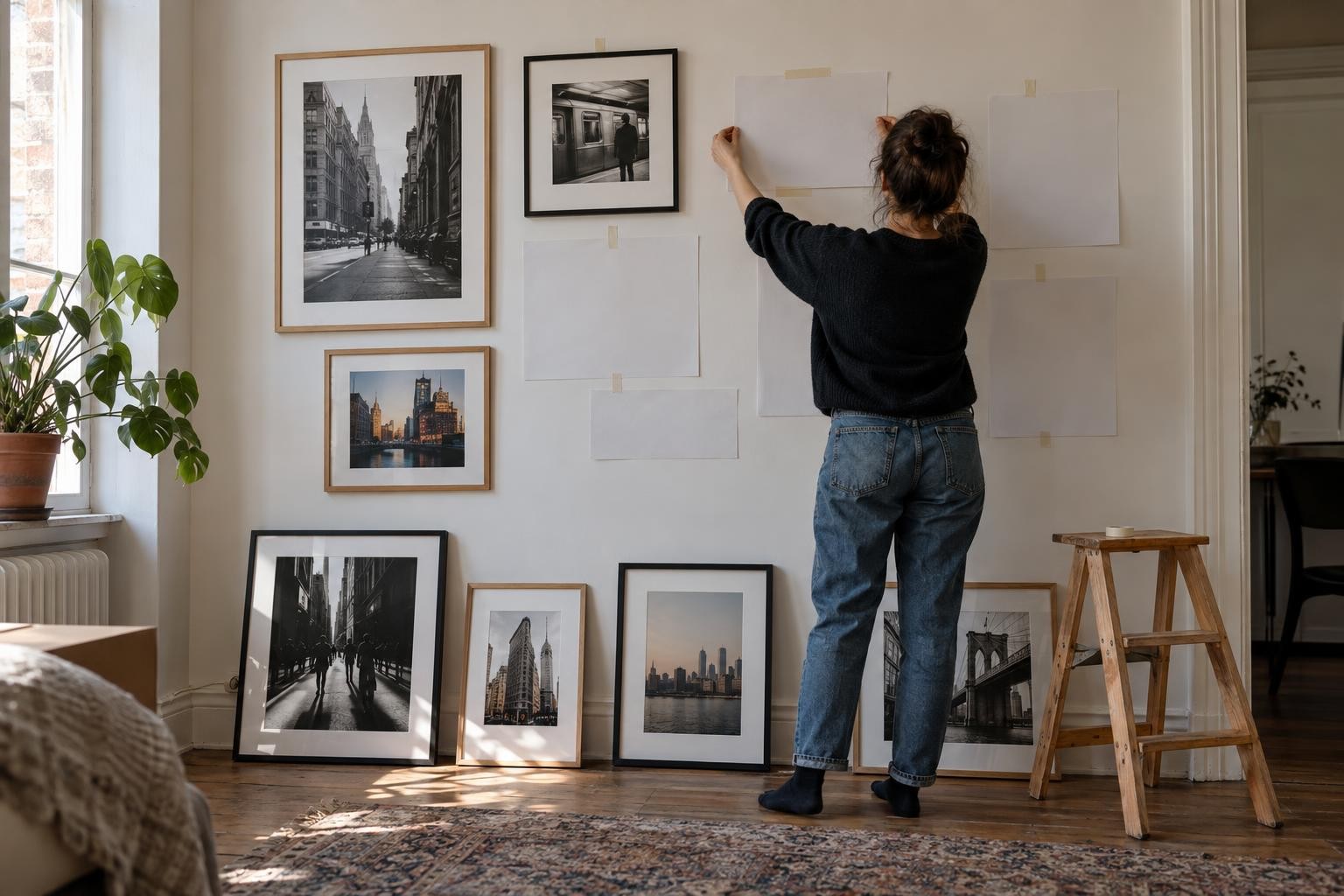
Cut leaves with the outer dimensions of each frame. If you don't have the frames yet, add a margin to represent their width. Attach the templates to the wall with a repositionable adhesive that will not damage the paint. Then step back into the room and look at the composition from several places: when entering, from the sofa and from the opposite corner.
This stage often reveals a problem that is not seen on the ground. A set may seem balanced on a table, but too high or too wide on the wall. Also check doors, switches, shelves and lamps. A frame should not interfere with the opening of a door or be too close to an eye-catching applicator.
For spacing, choose a measurement and keep it as constant as possible. A few centimetres may be enough between close frames. A larger space gives a more airy composition. The right distance depends on the size of the prints and the wall. What matters is that the eye understands that they belong to the same set.
When the arrangement suits you, take a photo with your phone. You can then remove the sheets, measure the hook points and fix the frames following the image. This photo serves as a benchmark during installation and avoids reinventing the composition at each step.
5. Adapt assembly to height and furniture
A photo wall above a sofa must seem to be tied to the furniture, not hanging very far above. Leave a visible space between the top and bottom of the frames. The composition often seems more stable when centred on the furniture, rather than on the entire width of the wall.
In a corridor, look at the images at the distance of passage. A frame too high can be difficult to observe. In a room where it sits, consider the sitting position. There is no universal height suitable for each dwelling. A simple marker is to place the center of the composition at the height of the gaze from the place where it will most often be seen, then to correct according to the furniture.
A large table, fireplace or shelf can also be used as a base line. Avoid automating all edges, but pay attention to alignments that attract the eye. A small gap may seem intentional. Several logical shifts can give a sense of disorder.
6. Mix frames without losing unity
Light, black and white wood frames can be mixed, but a visual reason is required. The same frame color around all the images gives a sober result. Different frames can bring more movement. In this case, repeat each finish at least twice, or keep another constant such as the cutout or spacing.
Photography must remain the main subject. A very thick or decorative frame can take over a discreet image. A simple frame often allows the colours, lines or details of the photo to do the work. The pass-out can separate the image from the wall and give it air, but it also changes the outer size of the set.
Before choosing, check the options available for each work. The format, the pass-out and the frame can vary from one draw to another. The guide on the choice of format, cut-out and frame explains how these elements change the presentation of a photograph.
7. Think about the light and the reading of images
The room light can change the appearance of a photo wall. A window opposite the frames may create reflections, especially if the prints are protected by glass. If possible, choose a side wall or observe the reflections at different times of the day before installing the whole series.
Also look at the colours in the real light of the room. A photograph of soft tones can be lost on a very colorful wall. On the contrary, a contrasted image can become dominant. It is not necessary to match the prints with each cushion or object of the living room. Once in the room, a color is often enough to establish a link.
If you frame several prints, consider their surface and maintenance. The guide to keeping a photo print at home details the simple precautions related to light, humidity and handling.
Easy to try compositional ideas
- The grid of four. Four frames of the same format, aligned in two rows. This is a simple option for a first composition.
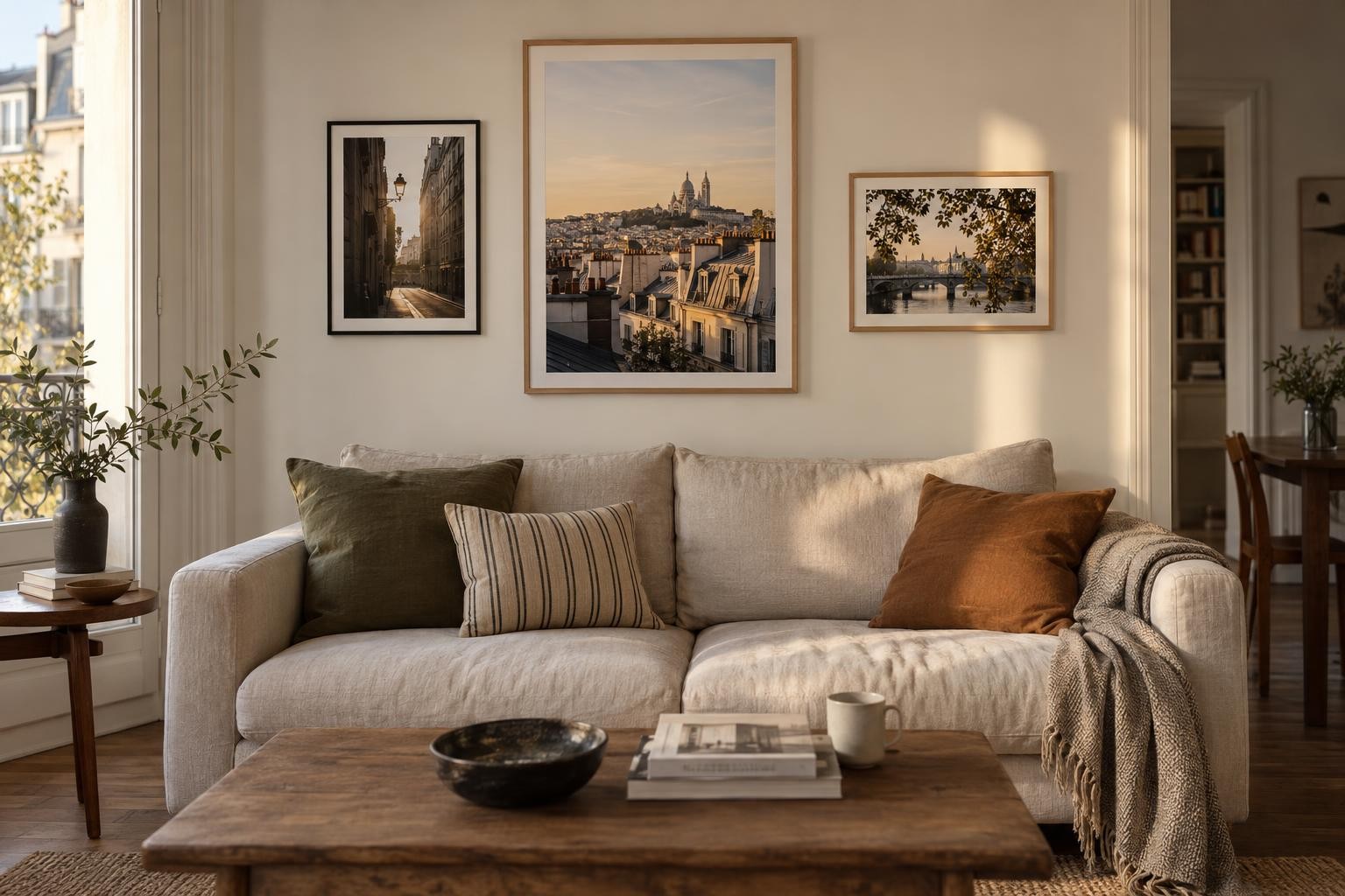
- The triptych. Three images linked by a place, colour or walk. The middle image can be slightly larger.
- The big frame and the little ones. Place a main image, then two or three more discreet views around. Keep a balance between masses and colours.
- The travel series. Mix a wide view, a street scene and a detail photographed in the same city. The difference in scale tells the walk.
- The evolutionary composition. Start with three frames and keep a free space. Add a new photo later, when you find an image that really completes it together.
These proposals are starting points, not rules. If a composition seems too strict, shift a frame or change the order of the images. Do it before fixing, then leave it for a few hours. Sometimes you can see better what's wrong after you leave the room and come back.
Common mistakes when making a photo wall
- Choose images after frames. The frame must accompany the photographs, not decide the composition alone.
- Hang on without a template. A few sheets of paper often avoid unnecessary holes.
- Fill everything. A wall does not need to be covered from one side to another. A little space helps each image to exist.
- Mix wirelessly. Images may be diverse, but a link of colour, subject or place helps to bring them together.
- Forget the outside dimensions. The frame and all-around take more space than photography alone.
- Ignore the reflections. Check the light and angle of view from where you sit.
Compose a wall that looks like a personal collection
The most interesting wall is not necessarily the most regular. It can gather photographs of different places, various formats and frames that are not identical. What makes the whole thing stand out is the choice of images and attention to their relationship.
I would start with a photo that takes me back to a particular street, meeting or light. Then I would look for two other images that prolong this feeling, without repeating the first one. A city scene can respond to a facade detail. A colour photograph can balance a calmer image. Finally, I would test the sizes and layout in the room before fixing the frames.
Original photographs each have their format and presentation options. On the shop, check the sheet of the work you are interested in to know the formats, pass-out and frames actually offered. The good wall is built around the images that one wishes to keep before the eyes, not around a decorative formula to reproduce.
Frequently asked questions about the composition of a photo wall
How many photos does it take to compose a wall?
Three images are enough to create a small set. For a larger wall, you can add more, but start by testing the composition on the ground. The number depends mainly on the size of the wall, frames and space available around.
Should we choose identical frames?
No. Identical frames give a regular composition. Different finishes bring movement, provided you keep a common link, such as a repeated color, similar pass-out or constant spacing.
How to avoid making too many holes in the wall?
Cut frames to frame dimensions and fix them temporarily with an adhesive suitable for your wall. Test height and balance from several locations. Once the layout is validated, mark the hook points.
Can we mix black and white and color photos?
Yes. Look for a meeting point between images, such as a form, subject, place or contrast. A black and white photo can also serve as a visual pause between more colorful images.
How to choose the format of the prints?
Look at the size of the wall and the distance at which the images will be seen. Use paper templates to compare formats. Think also of the dimensions of the frame and the pass-out, which increase the total size.